Oh my goodness, this is really hard.
I feel like I have wasted so much time with this exercise. I feel like it should be quick and easy to bring my fabric to life in yarn form but I have lost all confidence in myself and my creative ability.
Oh well, here goes…
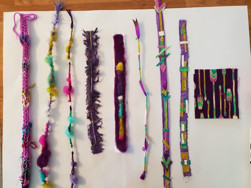
These are my Colour Placement and Composition samples. I have tried to stay as true to the source colours as possible. The two samples on the right are painted calico, using the same mixtures of colour as the ones I used in 3.1. I have tried to capture proportion of colour and bring in some simplified shapes. I feel the most successful are the 2nd and 3rd samples from the left, they are very similar but used slightly different materials. The calico samples will be a good base to start from in the later collage inspired exercise.
An option for taking this further could be more individual yarn wraps but woven in to each other, maybe even wrapped round wire to help build structure.
Materials exploration
This exercise did not get any easier, I have chatted with my fellow course mates and everyone has said how hard they found this, i’m not sure why it is so difficult. All I can think is that the brief is confusing us all, no-one really seems to understand what it is asking us to do.
Here is how I have interpreted it…

I chose this fabric for this part of the exercise. I thought a change would help kick-start me in to action. Pinterest was my first port of call.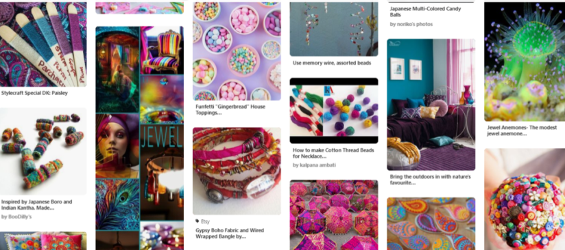 This is a section of my Pinterest board, when I looked at my source fabric I saw India, jewel colours, beads, sweet candy colours and buttons. Incidently the name of the fabric is Paisley Moon, so clearly I was on the right track.
As well as the embroidery and machine threads I had ready, I took to my bead and button boxes and took out some possible options.


My favourite sample is the second from the left, it was the most time consuming to produce, and used various techniques.
I wanted to represent the idea of “jewel colours” and use materials that are bright and bold. This is a little out of my comfort zone. I much prefer my safe black, white, red and grey colour scheme! Obviously the best way to achieve bright and bold are man made fibres and plastics.
I hadn’t really touched on the patterns and shapes in the source fabric, so I made one more sample to try and pick out a couple of elements. I feel happy with the way I translated the fabric in to samples, but I did not find it at all easy to understand the brief.
Further exploration could include more shapes from the source fabric. Using more traditional techniques for the base of my yarns.
Texture and tonal qualities
I chose to work from this fabric. It seemed like the best choice as I wasn’t sure how to make a fairly plain weave interesting.
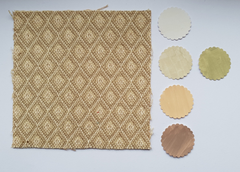
Here are my samples:
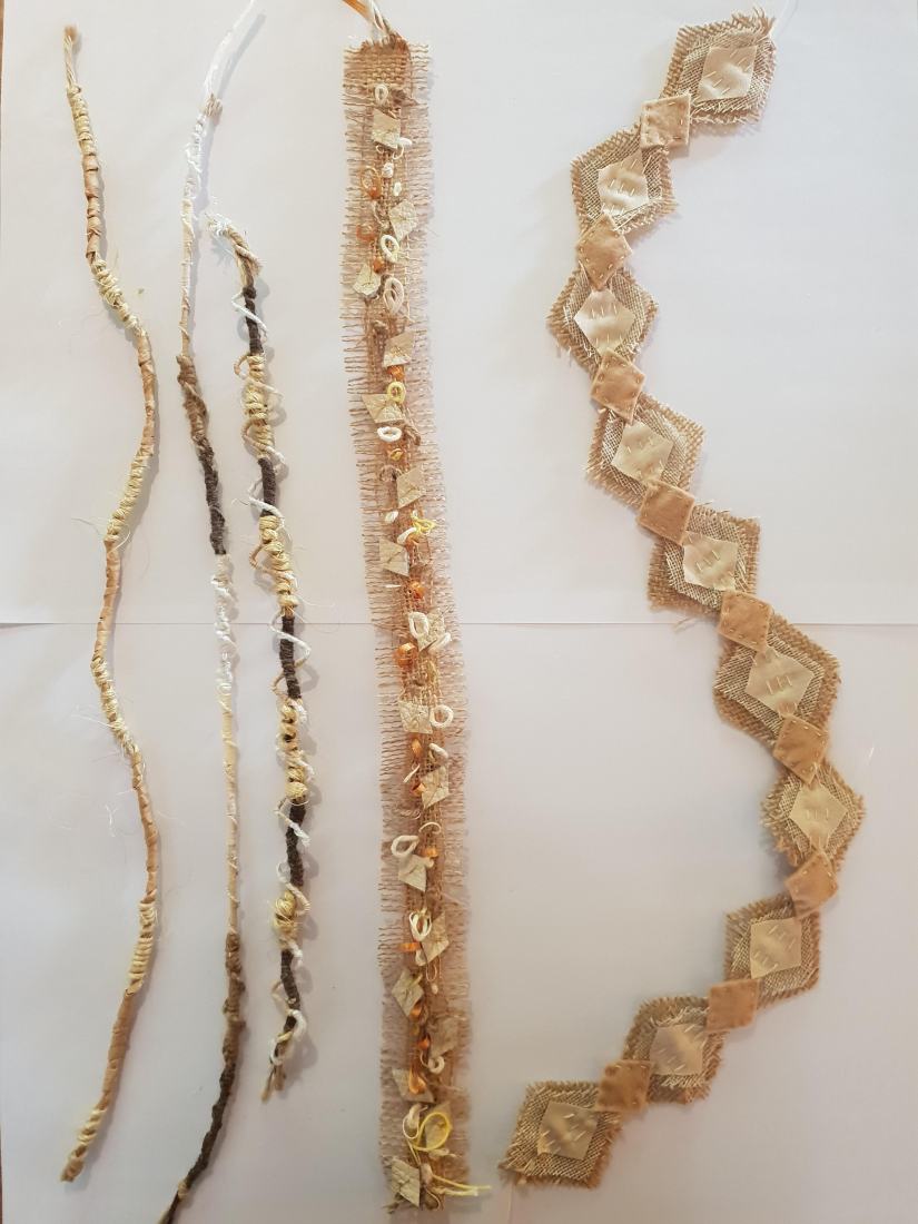
I found it hard to find the correct colours to match the sample fabric without going out to buy more materials.
The tonal samples were the hardest to translate because I just didn’t really know how to approach it. I stuck to wrapping yarn so I could move from one colour to the next.
It all felt a bit contradictory, “be sensitive to the tones present in the original textile and your painted work, but try to explore colour combinations as far as possible”. I think I might have to come back to this particular element.
I had a lot more fun with the textured samples, I picked out the diamond/zig-zag from the pattern on the fabric and used it in each sample. I also wanted to exaggerate the weave, so I made the loops with different neutral tones.
